Personas
These insights shaped the design goal: make voting clear, trustworthy, and easy to access. In order to guide the design, 3 user personas were created as part of the prcoess
Moodboard
The mood board captures a balance between credibility and youthfulness, using soft blues and neutrals for trust, with deeper tones for energy and optimism.
Drawing inspiration from the IEC’s colour palette, i wanted to ensure familiarity and authenticity, while rounded UI elements and lively imagery keep the design approachable.
Style Guide
Aa
Aa
Roboto Flex
Inter
Type face
Primary
Secondary
Accents
Neutrals
H1 Roboto Flex, 36px
H2 Roboto Flex, 24px
H3 Roboto Flex, 20px
Body Texts Inter, 12px, 13px
Roboto Flex, Bold
Inter, Regular
Inter, Bold Italic
Inter, Bold
Inter, Medium
Roboto Flex, Extra light
Aa Bb Cc Dd Ee Ff Gg Hh Ii Jj Kk Ll Mm Nn Oo Pp Qq Rr Ss Tt Uu Vv Ww Xx Yy Zz
Aa Bb Cc Dd Ee Ff Gg Hh Ii Jj Kk Ll Mm Nn Oo Pp Qq Rr Ss Tt Uu Vv Ww Xx Yy Zz
Aa Bb Cc Dd Ee Ff Gg Hh Ii Jj Kk Ll Mm Nn Oo Pp Qq Rr Ss Tt Uu Vv Ww Xx Yy Zz
Aa Bb Cc Dd Ee Ff Gg Hh Ii Jj Kk Ll Mm Nn Oo Pp Qq Rr Ss Tt Uu Vv Ww Xx Yy Zz
Aa Bb Cc Dd Ee Ff Gg Hh Ii Jj Kk Ll Mm Nn Oo Pp Qq Rr Ss Tt Uu Vv Ww Xx Yy Zz
Aa Bb Cc Dd Ee Ff Gg Hh Ii Jj Kk Ll Mm Nn Oo Pp Qq Rr Ss Tt Uu Vv Ww Xx Yy Zz
I developed a style guide that defines color, typography, and iconography — ensuring the platform feels cohesive, clear, and approachable across all screens.
Typography
Colour
Buttons
Logo
Inline button
Black
HEX- 000000
Navy
HEX- 0B314C
Red
HEX- D90404
Med Fidelity Wireframes
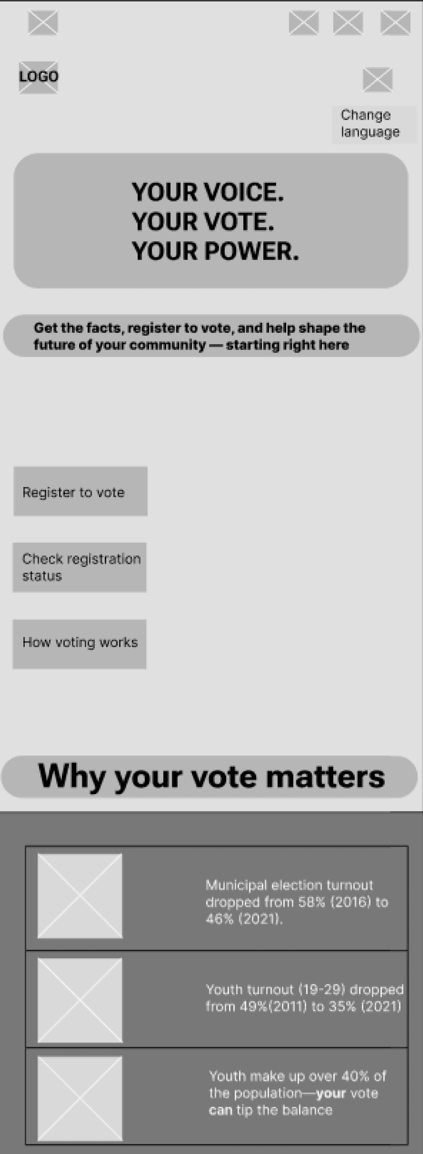
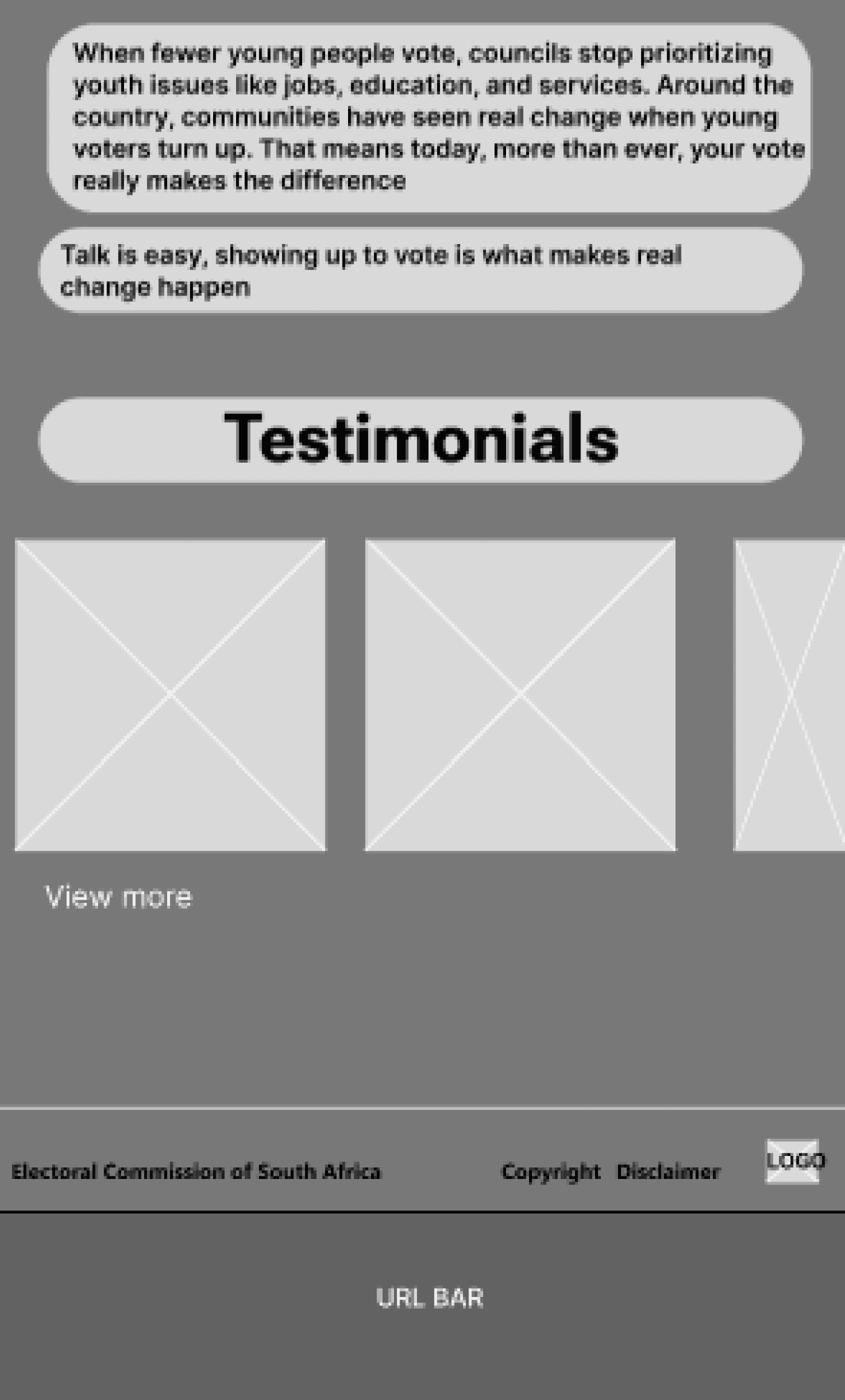
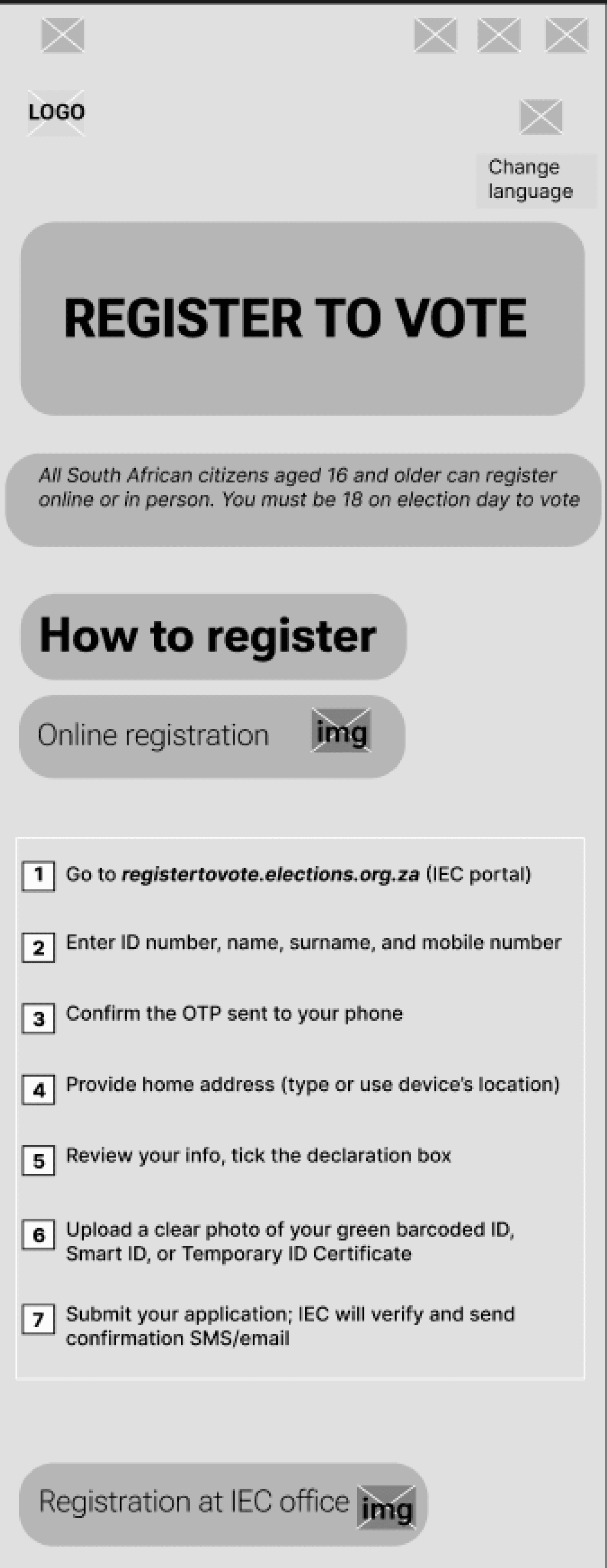
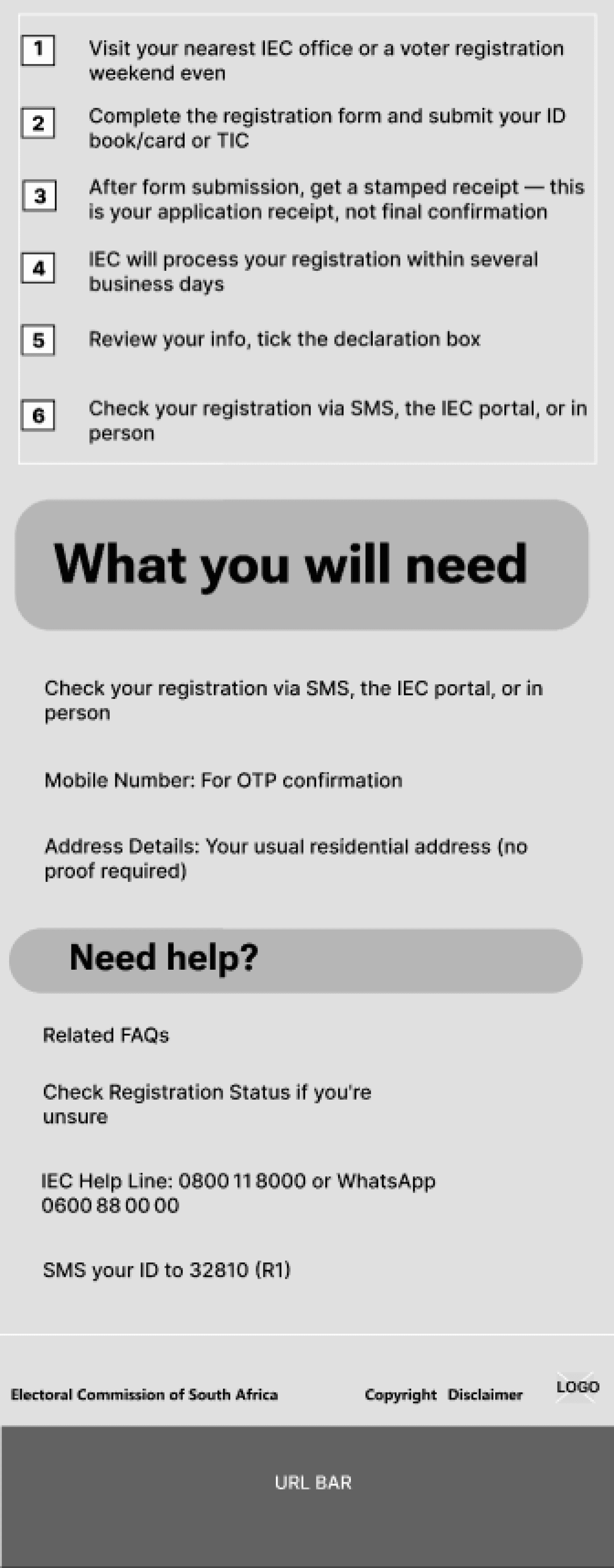
I developed mid-fidelity wireframes to define structure, layout, and key interactions.
This stage helped refine the visual hierarchy and user journey before moving into high-fidelity design and prototyping.
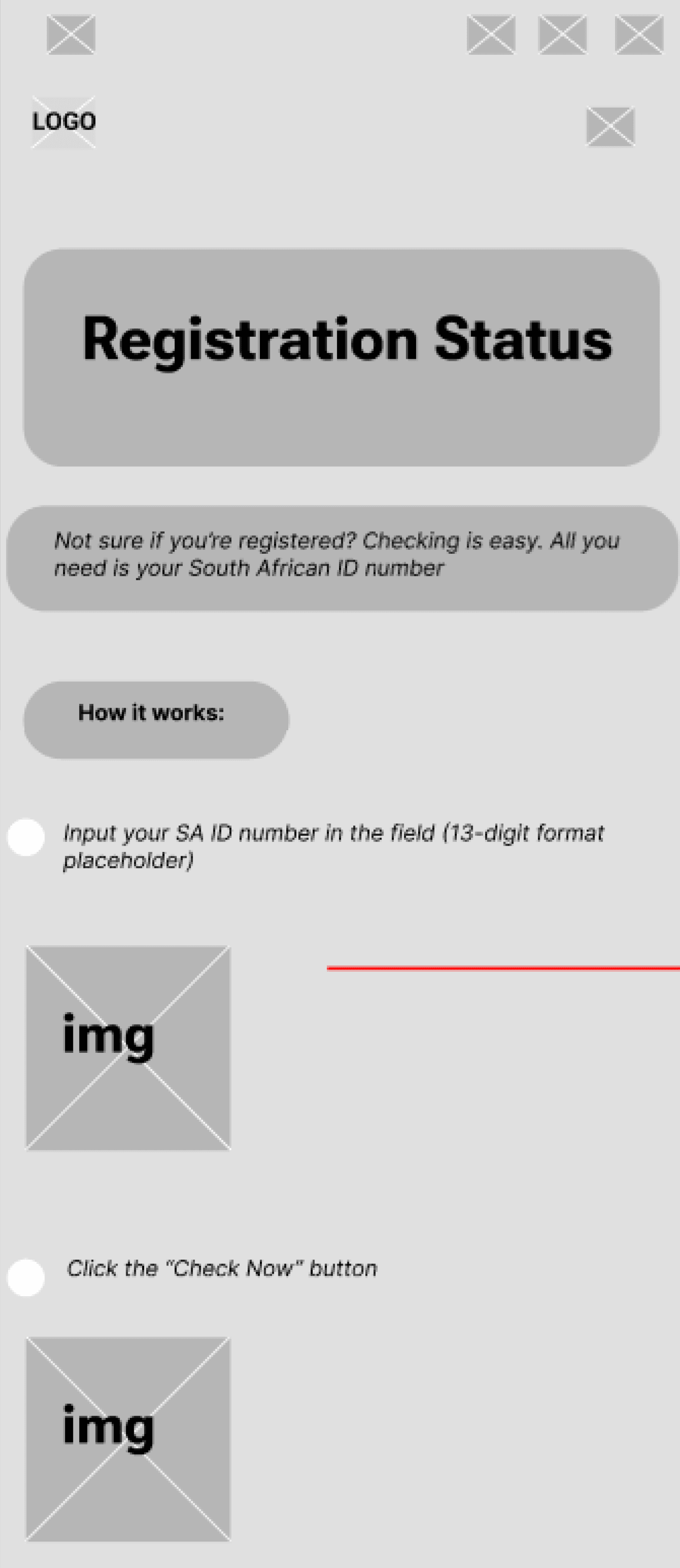
User Flow
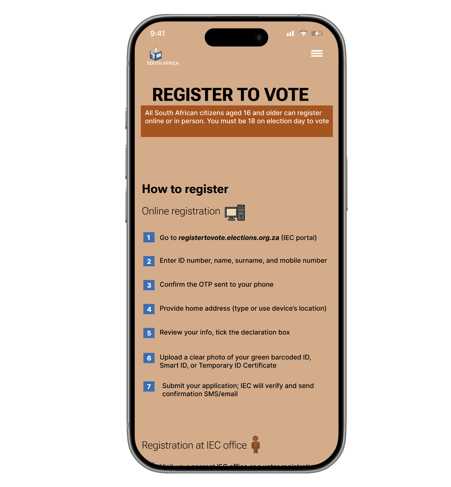
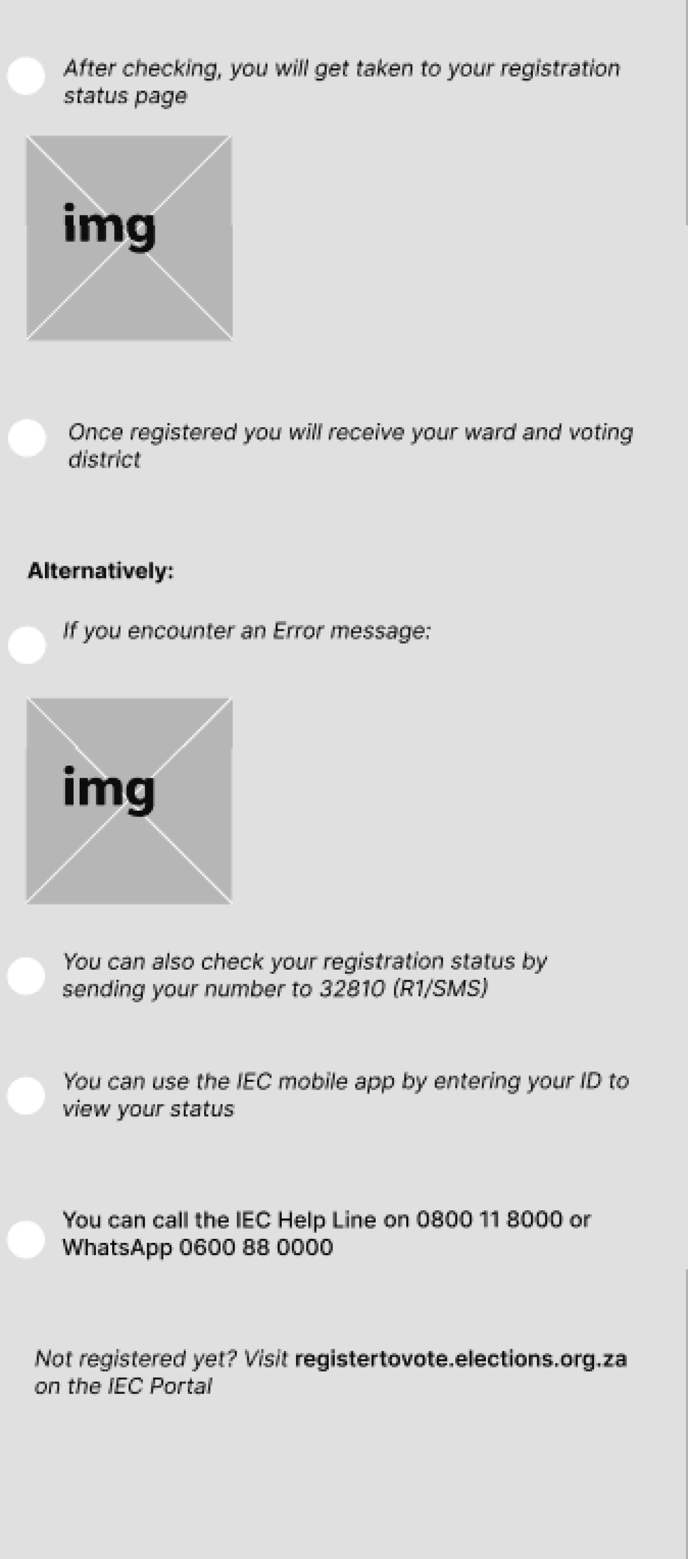
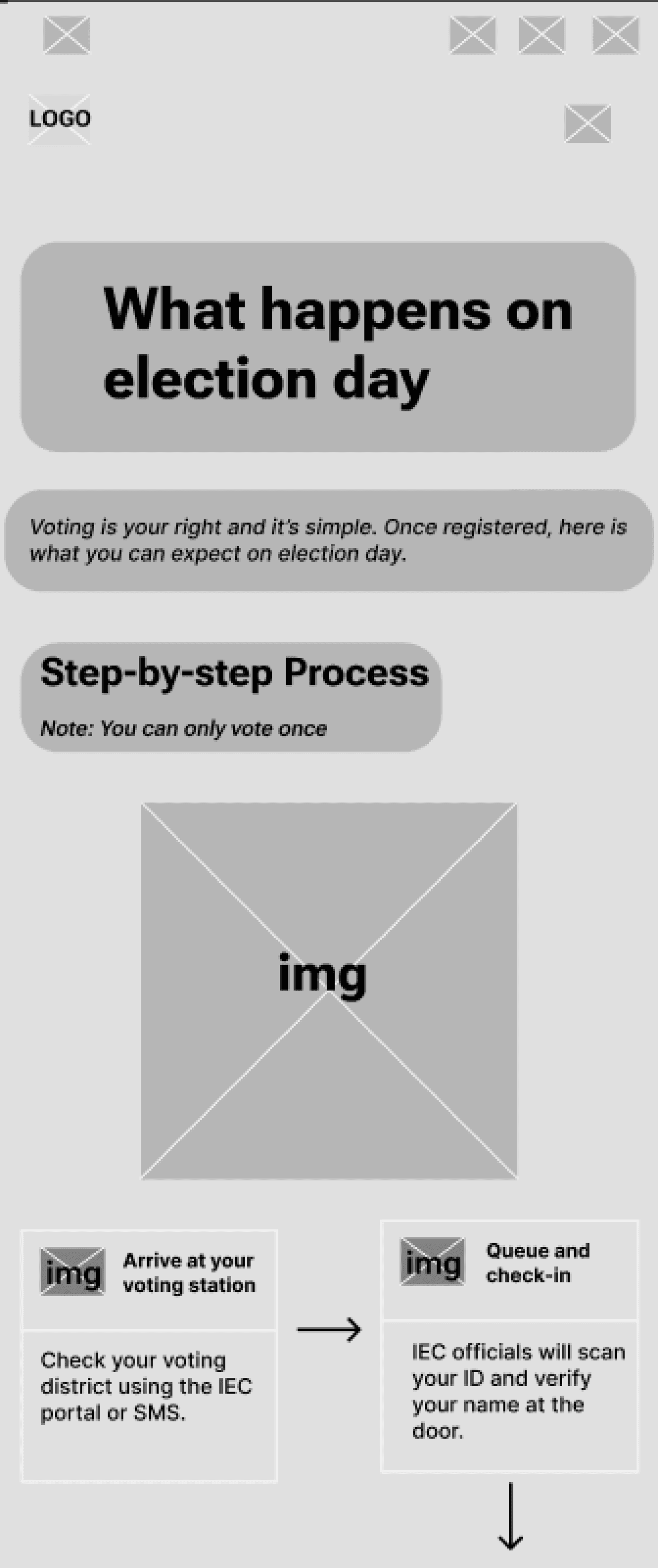
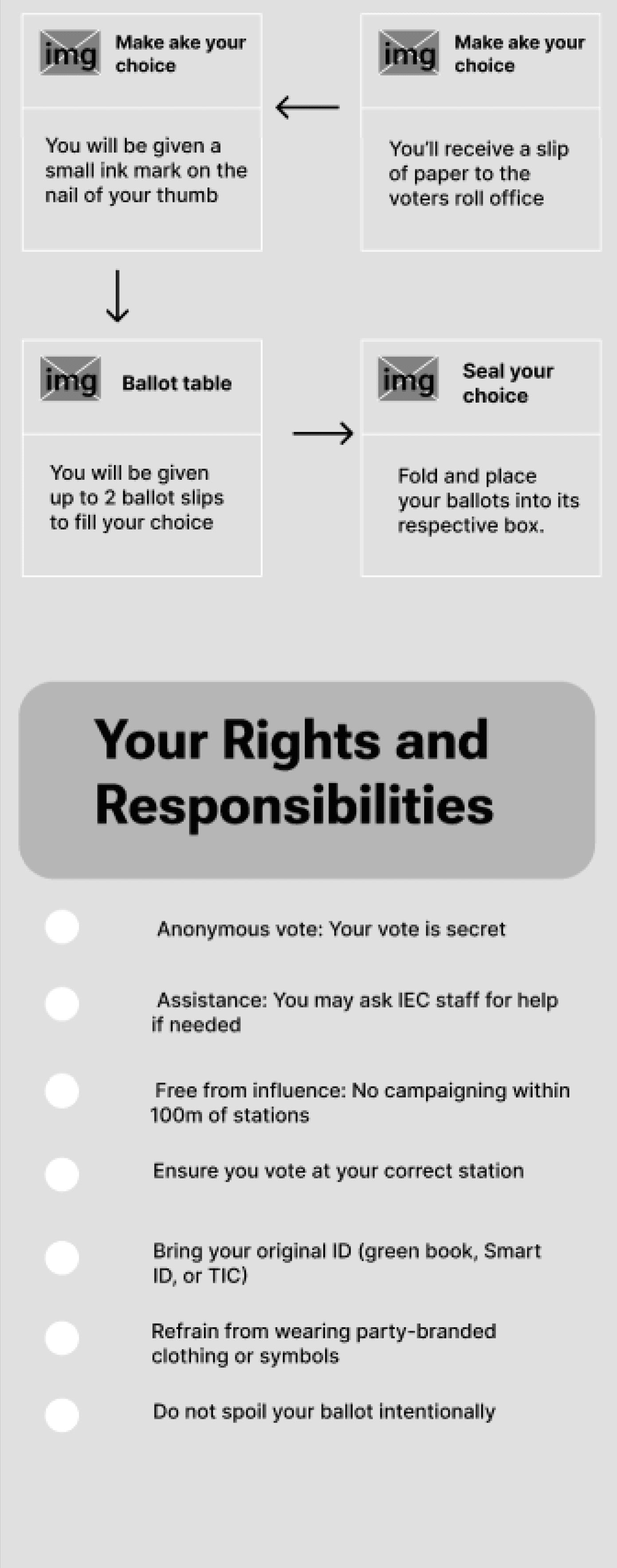
The user flow focuses on a key task — specifically the registering and checking registration status page.
It outlines the essential steps for users to complete their goal efficiently, ensuring a simple and transparent experience from start to finish.

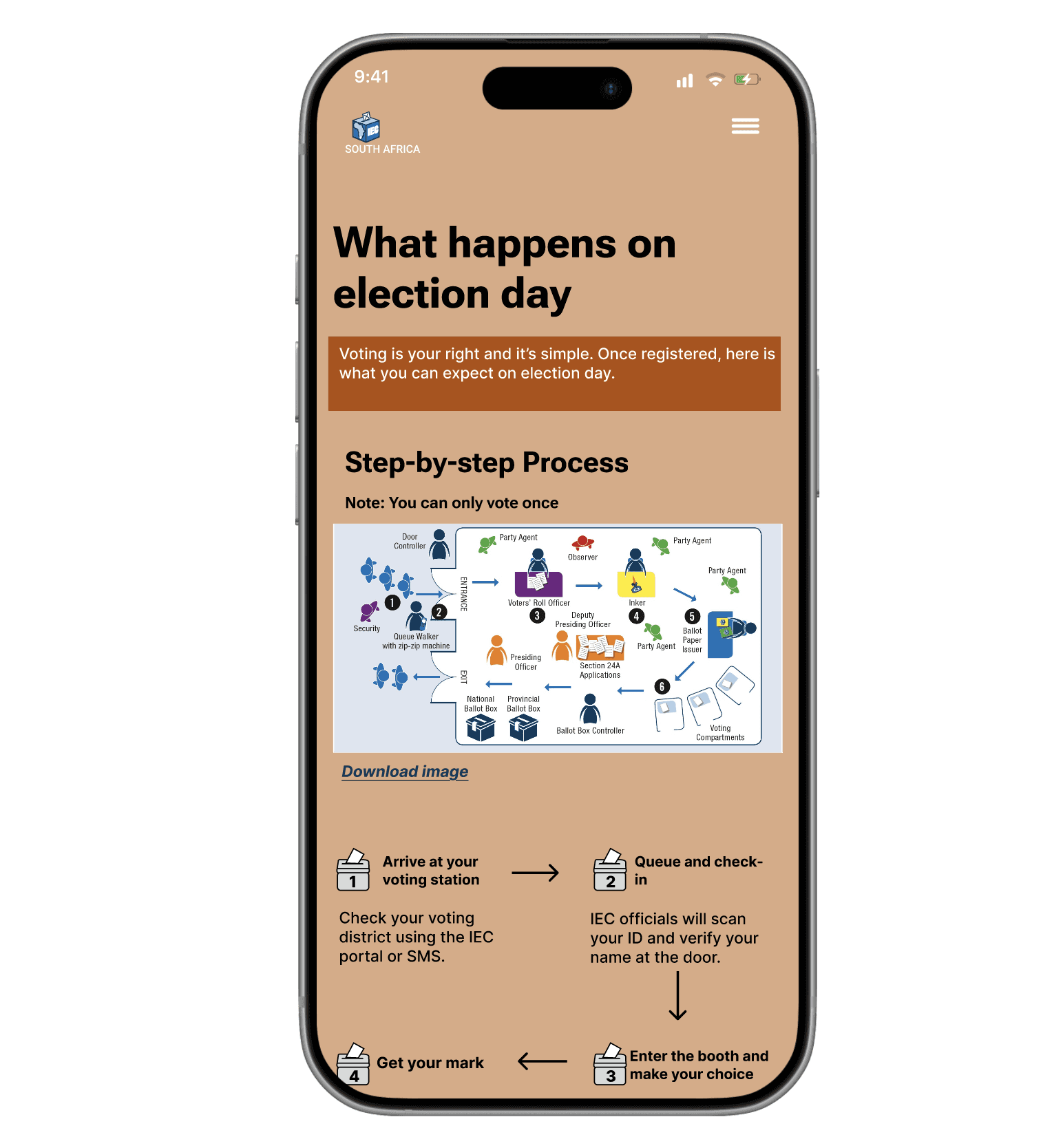
The final prototype demonstrates a fully interactive mobile experience designed to make voting information clear, accessible, and easy to navigate for young users
Takeaway
This project strengthened my focus on clarity and accessibility when designing for young users. It reinforced how important structure and hierarchy are when presenting complex information including showing me how thoughtful UX decisions can make serious topics feel more approachable, trustworthy and yet easy to navigate.
rirandzu.ngobeni@gmail.com
© 2025 RANDZU - GAME OVER?
Peach
HEX- DBAA85
Blue
HEX- 246EB7
Burnt Orange
HEX- B34E00
White
HEX- FFFFFF
Neutral
Hover


Impact & Outcome
Simplified voting information into clear, step-by-step flows for first-time voters
Reduced cognitive load by breaking complex processes into bite-sized sections
Designed for accessibility and trust using calm visuals and clear language
Created a prototype that can be used for voter education and awareness campaigns

rirandzu.ngobeni@gmail.com
Get in touch
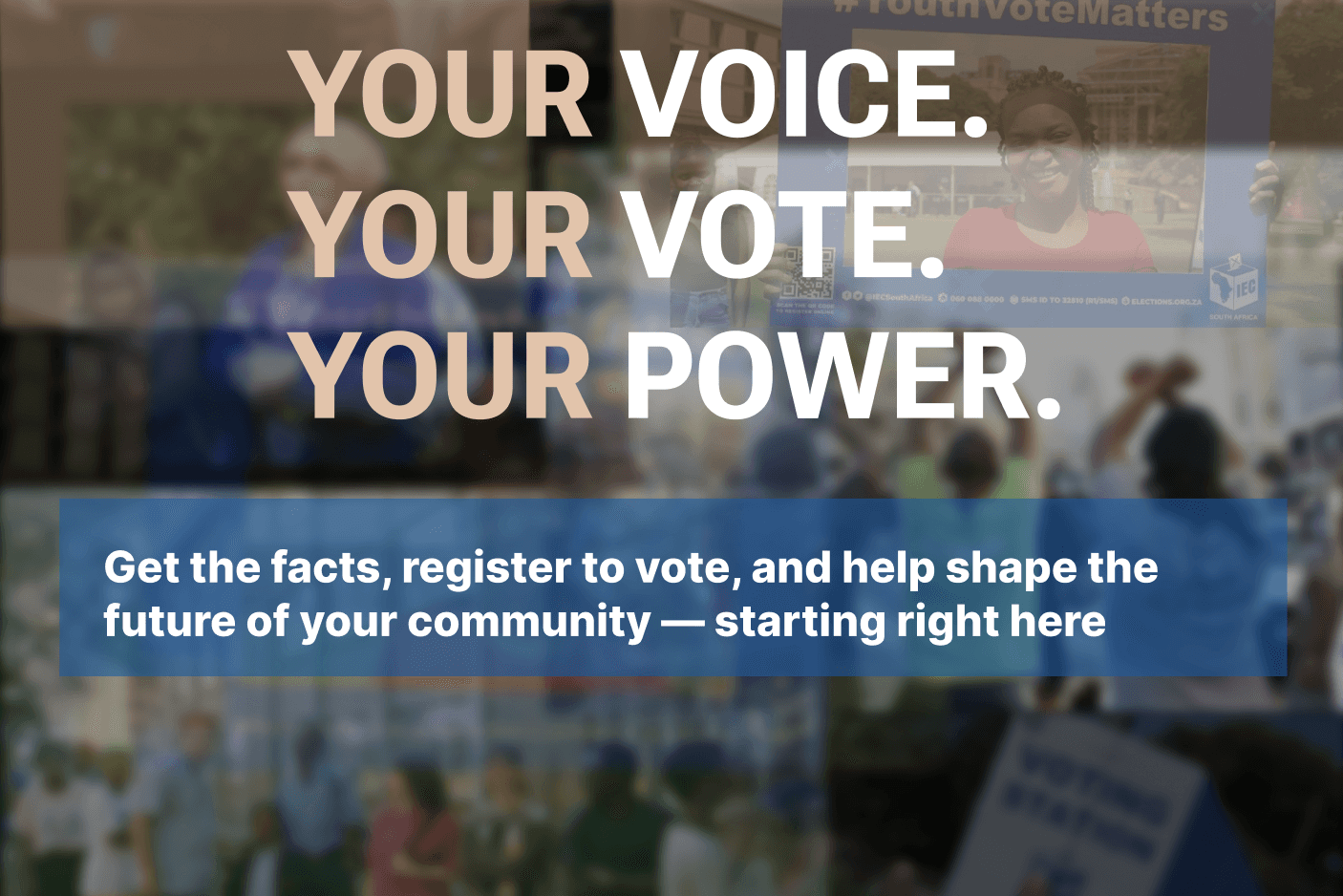
Designing for Democracy: Youth Voter Education
Overview
This project focused on designing a mobile voter education platform for South African youth. With turnout among 18–29 year-olds below 20%, the goal was to create a clear, impartial, and accessible space where young people can learn about registration, the voting process, and their rights—while encouraging greater participation in future elections.
Problem
Young South Africans often feel their vote doesn’t matter and struggle to access reliable, engaging information about elections—leading to low turnout and ongoing apathy
Solution
I designed a mobile-first prototype that simplifies voting information with clear flows, visual storytelling, and approachable UI to build trust and engagement among young voters
RN

Projects
Contact

Discovery Stage
The Process
Figma Prototype
Timeline: 4 weeks
Role: UX/UI Designer (Research, Wireframes, Prototyping)
Tools: Figma, Canva and Word
Overview
This project focused on designing a mobile voter education platform for South African youth. The goal was to create a clear, impartial, and accessible space where young people can learn about registration, the voting process, and their rights, while encouraging participation in future elections.
Problem
Young South Africans often feel their vote doesn’t matter and struggle to access reliable, engaging information about elections—leading to low turnout and ongoing apathy
Solution
I designed a mobile-first prototype that simplifies voting information with clear flows, visual storytelling, and approachable UI to build trust and engagement among young voters
Your Voice
Designing for Democracy: Youth Voter Education
Primary
short interviews were conducted with individuals aged 18–29 to understand their attitudes toward voting, their level of knowledge about the process, and what might motivate them to engage more actively. The responses helped identify emotional and informational barriers that influence youth voter turnout.
“

Voting feels like this huge thing no one ever actually properly explains to us
“
It’s not that I don’t care. I just don’t know enough about how it all works.
Secondary
Only 20% of South Africans aged 18–29 voted in 2024.
Many young people don’t trust that their vote makes an impact.
The voting process feels confusing and unapproachable.
Key Takeaways
Many South African youth don’t trust that their vote makes a difference, leading to disengagement.
There’s a lack of accessible and engaging voter education, especially on mobile platforms.
Complex information and unclear processes make the voting journey feel intimidating.
Visual and interactive learning methods resonate more with younger audiences.
Youth respond best to relatable, positive, and empowering messaging rather than formal or political tones.

